A Little Bitty Wine Break
Frances Mayes’s Tuscan Sun Wines are from her villa in Tuscany. Most know her and her vinery from her story “Under the Tuscan Sun.” The 2003 film’s success helped Frances’s wines on the market within the states and from consumer studies, they are currently still a go-to for women over 40. With the client not ready for a big change in identity to target a wider audience, the Tuscan Sun Wine labels were at least due for at a light refresh, which lead into the new collateral. Above is the revised label from Shawn Brady. A much cleaner design with the same traditional, Tuscany aesthetics previously designed for the brand.

In the Background
I never received much background of the brand’s visual direction, but it was clear that it did not creatively adventure too far away from a conservative Tuscany identity, nor did they own the tagline “A ray of Tuscan sun shines in each bottle” by literally using the sun icon more prominently in label designs. I did find the creative process honorable to Tuscany culture once I dug around in the archive. They took a documentary approach to reveal the background of the “Under the Tuscan Sun” story. Definitely more directed from marketing then a creative team, it was at least a transparent brand. The team behind the branding visited the villa, learned in-depth about the land and winemaking, and commissioned a landscape artist to paint some of the documented sites to serve as a “Taste of Tuscany” for each wine variation. The entire brand’s identity was focus on the geographical identity of Tuscany, from imagery to the typography. While the new label design stayed true to this direction, it also modernized it a touch with bolder, physical features. It was now time to push this change into the collateral.

Something a Little New
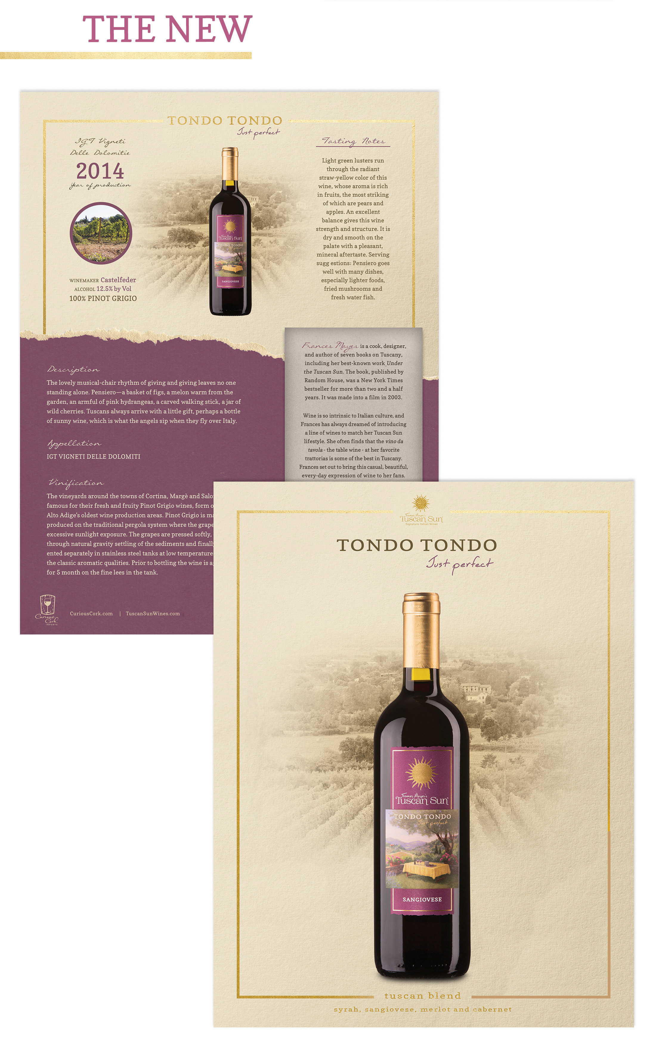
I kept the current visual content but refined it a bit with more of a vintage appeal. For the One Sheet featured above, you can see some of those physical features of the new label and bottle coming into play. I did preserve the warmth of Tuscany with the use of neutral colors to softly tie back to previous designs. But for the most part, I just stayed true to the new label design. The bold, rectangular shape of the label is prominently a supportive shape within the One Sheet design. I also visually reiterated the gold lining and the circle within the Sun Mark. I found some nice cotton paper that I ripped and scanned to preserve a deep texture desired for a vintage appeal. We do not always get to push ideas and designs as far as we would like, but a little bitty step to make what you currently have better is still something to be happy about.


