Lessa is a online mattress company with a simple vision: “A better place to sleep, A pathway to a better life.”
I was asked to design a brand experience within a pop-up exhibit/store that would be traveling throughout the States. While Leesa is sold only online, this would be an opportunity for consumers to trial the mattress after learning more about the making of the product and the brand story.
With no budget and just a few days to put something in front of client, we created a full experience flow without regard of space, time or aesthetics, knowing it would be easier to eliminate later once we moved into campaign development. Doing this first allowed us to focus on the genetic needs of the pop-up.
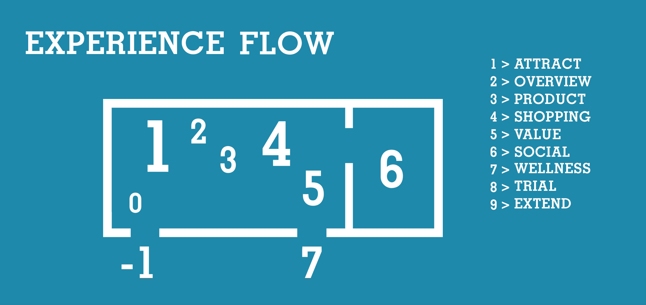
Part 1: Determine the Consumer Needs
I saw the sole purpose of the Experience Flow to ready the visitors for the trail room, from transparency to emotion. Unlike the online shopping experience, the pop-up could allow potential customers to have a thoughtful, emotional interaction with the brand and its product. This is the most important ingredients for brand loyalty.
The intro of the exhibit would be the unboxing of the mattress; basically the mattress acts like a newly wet sponge, transforming from the shape of the box into a full size mattress. This would be the base for a creative direction to draw people in. Once within the pop-up, we wanted to introduce the product in the raw with the Mattress Story. This is where I pushed for physical interactions with the materials of the mattress to increase curiosity and help secure consumers’ trust in the quality of a Leesa Mattress. From there the next steps focused on the online shopping experience before the focus turned on to the brand story. Here are a few of my favorite aspects that were defined for the Experience Flow:
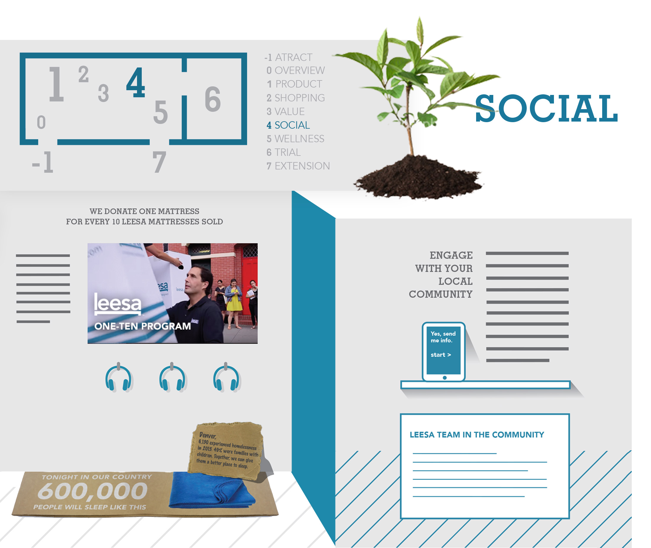
Social Impact Story: A Brand’s Mission
For every mattress bought, they plant a tree. For every 10 mattresses bought, they donate a mattress to a homeless shelter near you. And if you do not buy the mattress at the end of your 30-day Free Mattress Trial, it is picked up and donated to those in need. How cool is that! I wanted to put a spotlight on this mission so visitors could physically see the difference they could make with Leesa for their community. From a live tree to the volunteer programs, visitors had the option to engage with a short documentary or just check out the shock factors from the exhibit’s main installations. My favorite piece is of course the simple cardboard display, featuring National and Local Homeless statistics on a typical, homemade bed that could be replaced with a Leesa inside a shelter.
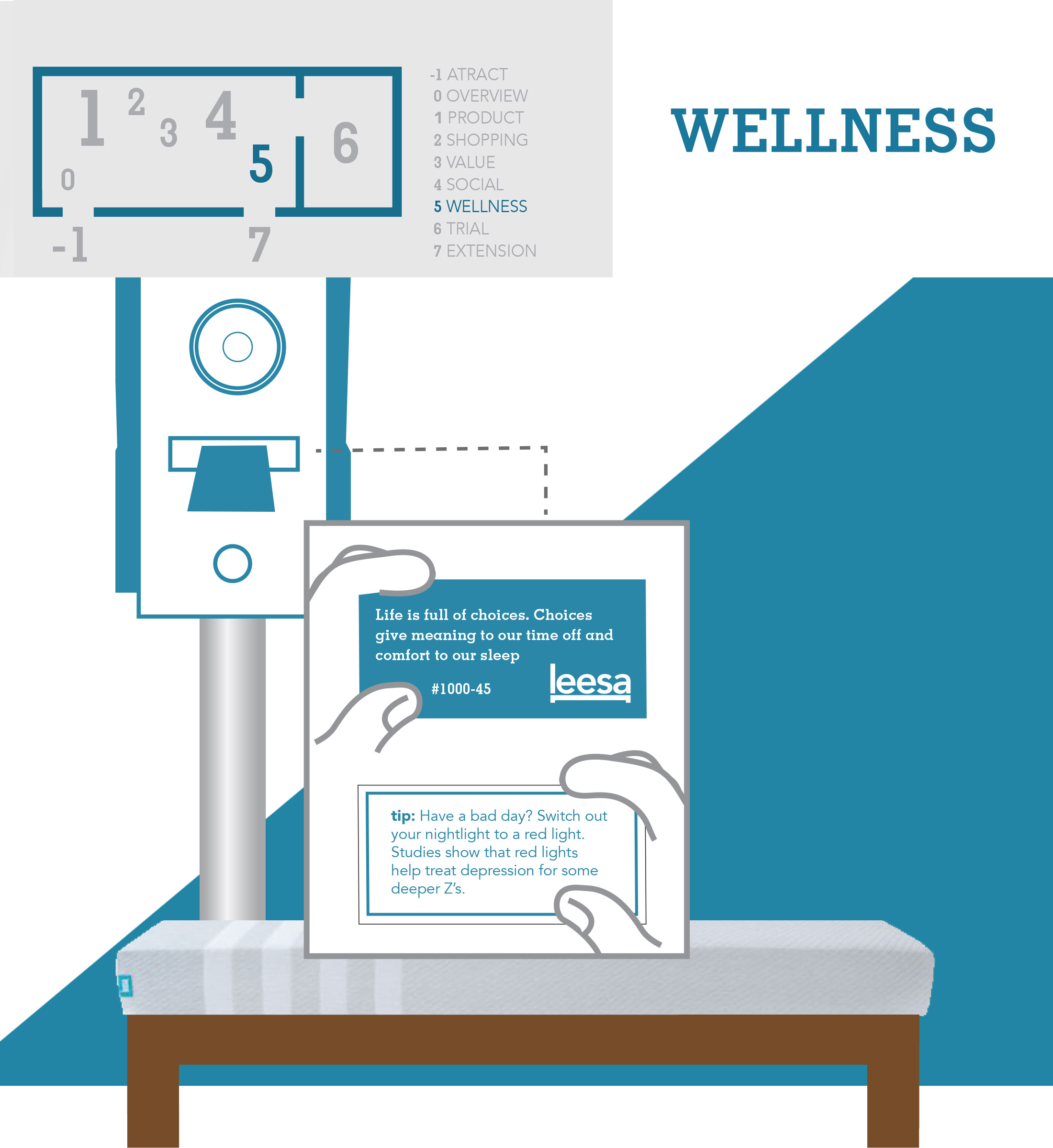
Wellness Center: Ready for Bedtime
In my research to tackle the wellness area of the pop-up, I learned a lot about healthy practices for bedtime that have helped me catch better Zzzz's. From purifying the air with salt lamps and essentials oils to activities that wind you down, it is a lot more to it than just turning your screens to Night Mode. The Wellness center served as a waiting area for the Trail Room, providing best practices for sleep as entertainment. The area was equipped with practices such has writing, reading, and listening to chill vibes before you turn the lights off. To help drive these new habits, the Take-a-Away Journals, Leesa’s Book Clubs and Playlists would be accessible to consumers once their visit in the Pop-up was over.
Leesa’s vision of “pathway to a better life” is supported in both their Social Impact and Wellness Story. They had a handful of articles and posts informing their network on the science of better sleep and were also currently in the works of partnering for a sleep app that would communicate with smart watches. I wanted to identify them as leaders in advocating healthier sleep for more productive lifestyles. Also, I still had not tackled a social media integration and needed a simple Take-A-Way in the pop-up for everyone. Not a big piece of paper or website biz card, something useful that they might want to hang on to.
I somehow manage to keep fortune cookie slips and tickets from movies and events, throwing the programs and other one-sheets away. This is what I put my focus, something that may not be tossed so easily. I liked the simplicity in the small ticketing machine for parking at the Denver REI store, the sound it makes remind me of the old fortune machines. Once I figured out the manufacturer, I found some smaller shops that rented them without the network setup. This became my favorite piece in the Wellness Center, proposing an example which provided words of wisdom in relation to the Leesa Brand on one side and an informed tip for better sleep on the other. This machine could be linked to a tablet app, allowing for an integration of a camera for instant social posting. I also had planned on using these with promo codes, winning big discounts on mattresses if guests bought on-site and lower discounts when they buy online at a later date.
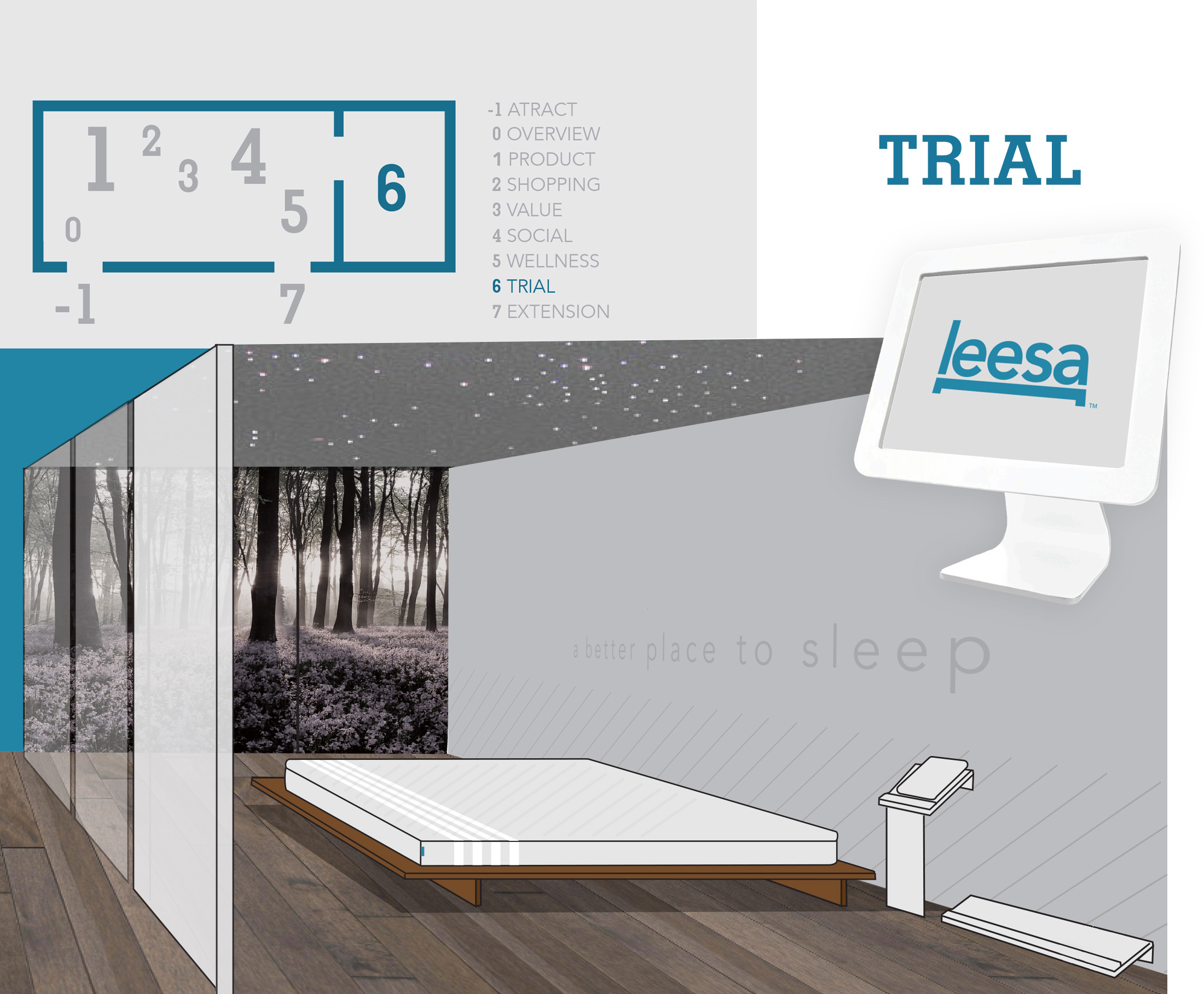
Trial: A Better Place to Sleep
The Trail Rooms are controlled environments for the visitors to try out the mattresses in an experience worth talking about. Leesa claims “the best-rated mattress” and wanted to promote customer reviews from the pop-up. The client did not want consumers having to test out the mattress in a public area, they wanted consumers to have a one-on-one with the product in a comfortable setting. I hated to break it to the client, but trying out a mattress is not special enough to wait for and with the foot traffic we were expecting, we would not be able to give away 20 minute naps. Getting people to sign-up for the room before they became entertained in the Wellness Center was a must to buy us some time. I had to come up with an 10 minute experience for the trail room that was cool enough that people would wait around for if the rooms backed-up and that did not take away the focus off the product. I also had to encourage visitors to review the mattress either in the room or after the trial.
That was not the only problem. Knowing I would have limited space, I had to consider the possibility of claustrophobia in the rooms and we also needed to use the mattress for display as well. Instead of blocking the trail room with a solid wall, I wanted to create the illusion of more space by using a glass wall. We found smart glass, a simple technology that tints or shades with lighting; just like eyeglasses that turn into sun glasses. This not only allowed for privacy for visitors during their trail, it allowed us to keep the mattress on display in a luxurious disposition to give visitors a stronger desire to go inside the trial room.
With the Wellness Center positioned before the Trail Room, it provided an opportunity for visitors to setup their rooms for their 10 minute trails with custom settings while learning about different environmental aspects that promotes healthier sleep. On a Kiosk, visitors could pick their own Oasis from options such as Outer Space with pink noise or a Rain Forest with the sounds of wildlife. The options would be determined by the campaign identity later on. Regardless of visuals and sound, the airflow and scent of chamomile would remain the same for all custom settings and the low lighting would be motion active.
A Prototyping Tool for Planning

Being directed to put so much attention on the experience flow before concepting campaign ideas, I wanted the floor plan to strongly be in accordance of the campaign concept. I had a handful of facts to consider:
- The information given was clear that Leesa did not want consumers having to test out the mattress in a public area, they wanted consumers to have a one-on-one with the product in a comfortable setting. This made the floor planning a bit more difficult, demanding visitors to commit to a time investment.
- By this time, we knew that we would be using a 40 ft. container. I now have a defined space to work with for concepting a floor plan with a campaign idea.
- The container’s long sides are made of 5 ft. panels, each which could rotate with custom rotating pole anchors. I discovered this by researching pop-ups in containers on pinterest and other design blogs.
- It would safety travel from state to state, so it would be dropped off from a trailer with a crane at each location stop. This meant that once I got into the design details, we will want to make sure everything is securely bolted
- This sucker required some power sources to outside generators and street sources, so I had to leave room for inner wall space to hide wires and vents.
- We had a variety of different bed sizes. I had to consider their dimensions and what size was best for the visitors’ experience depending on the campaign concepts.
To make things easier for me, I mocked-up a simple prototyping tool mimicking what I knew could be adjusted on the container. From there, I was able to swing the panels around and come up with a variety of floorplans by using the panels as internal and external walls. A sheet of clear vinyl and some dry erase markers and I was on a roll! Just like I would do if I was wireframing interfaces for a website, I came up with as many different alternatives as possible in a set timeframe and then came back around to review. First I trashed the floorplans that were bothersome to the experience flow and trail room needs. This gave me a good handful of floorplan options to pick from for each campaign concept.

Part 2: Campaign Development
After the Experience Flow was approved and I figured out some of the logistics pertaining to the floorplan, it was time to make it fun! Here are my initial concepts with sketches of exterior and mood boards:
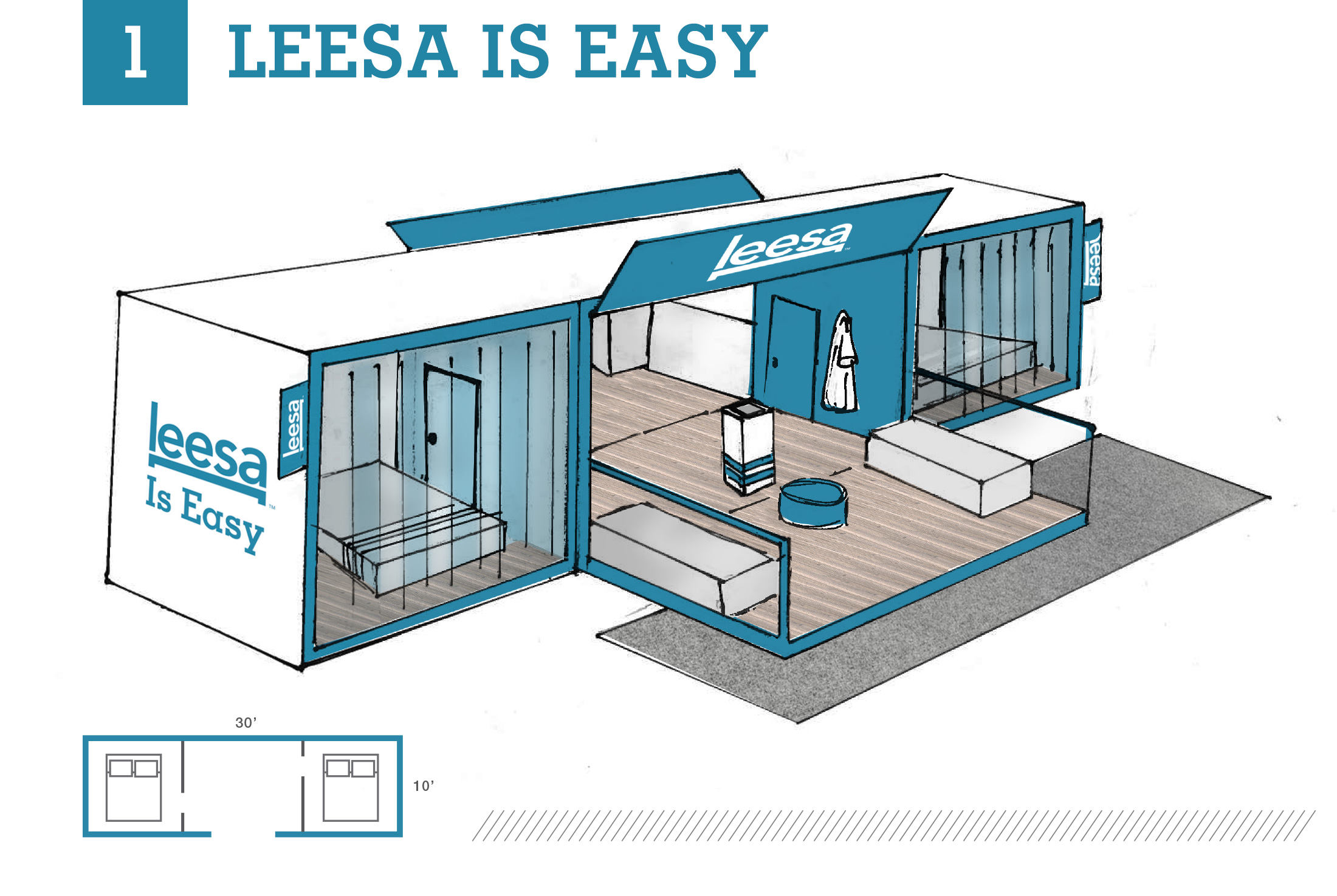
Pop-up Concept 1: Leesa is Easy
Originated by Shawn Brady, this idea addresses the elephant in the room. Have you slept with Leesa yet? But all jokes aside, the Leesa mattress is a simple design, allowing for an easy setup. From a few clicks online to delivery at your doorstep, Leesa has made it easy for you to get a quality mattress without the hassle. Inspired by our questions and the easy-going experience consumers have with Leesa, this concept provides a laid-back, lounge environment for guests to stroll through and take it easy for a bit as if you were in a nice vacation home.
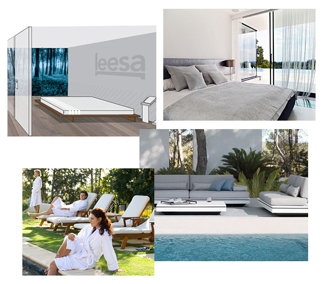
Moodboard
Open, Inviting and Sterile with a free-range, home-felt Interior *Pictured to the left.
Trail Room
Lit with natural lighting with the controlled use of the Smart Glass, this trail room provides a calming oasis with a cinema screen wall, providing realistic nature sceneries and chill vibes to set the mood while guests kick back on a Leesa mattress to see if it is a match. *Pictured to the left.

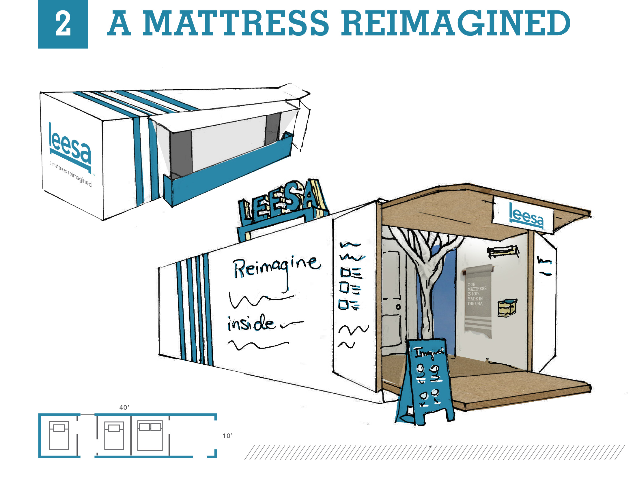
Pop-up Concept 2: A Mattress Reimagined
Inspired by Leesa’s other tagline “A mattress reimagined.,” and the figurative layers of the mattress design, this concept takes the consumer into an imaginative environment within the Leesa Box to “reimaged the box from the inside.” All physical content is designed with a layering effect to reference the value-depth of Leesa from quality materials to the brand’s mission. Displays are built with the materials used from the construction of the mattress, leading visitors through an inventive introduction of the brand and product while accentuating the quality of both.
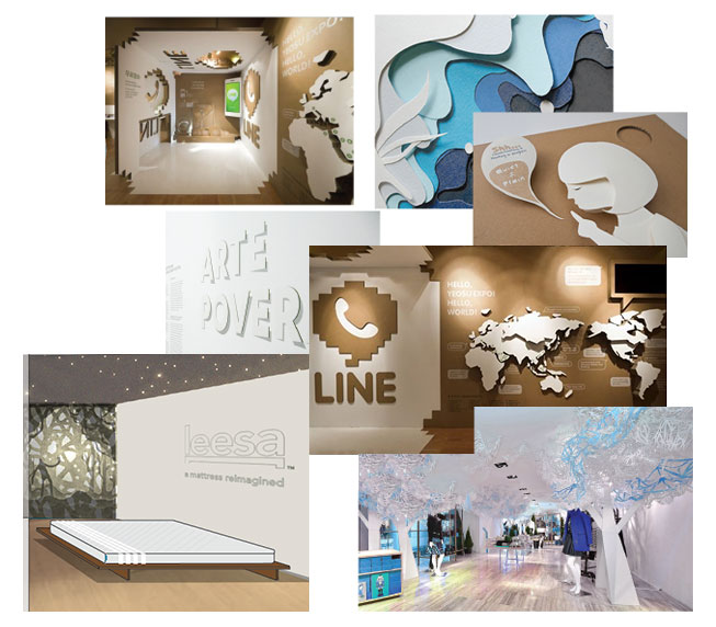
Moodboard
Imaginative, Illustrative, Raw, and Tangible with an Emphasis on Shadow and Light for a Narrative Atmosphere *Pictured to the left.
Trail Room
Each room is a habitat with an artistic oasis environment. A lightbox wall allows shadow and light to play together within the layered cut-outs in front of the backlight. Light glimmers on the ceiling and warm audio tones put guests “in a dream box” while testing the Leesa mattress in rest. *Pictured to the left.

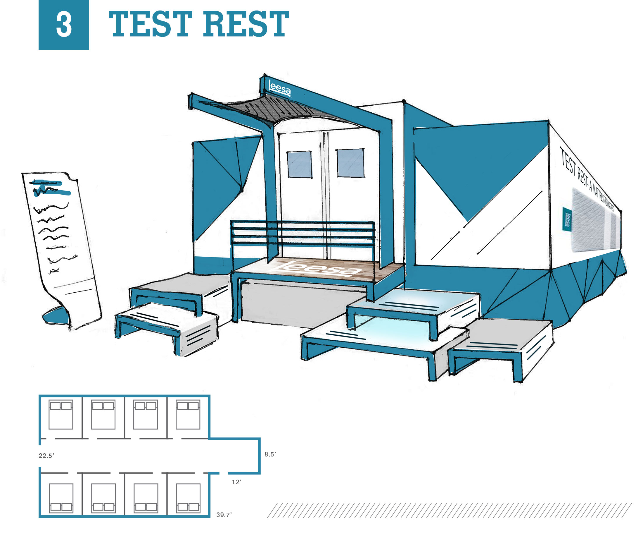
Pop-up Concept 3: Test Rest Lab
Inspired by Leesa’s ownership of the identity “best-rated mattress,” this concept invites consumers to put that to the test within a “test lab” experience. Visitors will interactively review the mattress throughout an experience flow designed as a gamified rating system before final submission of their customer review to Leesa on exit. This concept has a primary focus on the product, placing the brand story in the backseat.
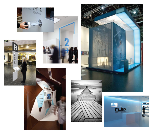
Moodboard
Transparent, Airy, Stark with Informative, Functional Interiors utilizing a Modern, Swiss Design Style with hints of neutrals from nature realism *Pictured to the left.
Trail Room
This direction eliminated the original Oasis experience determined in the Experience Flow. Instead, guests are given a checklist, paired with check points in the room and on the mattress, leading them to test support, comfort, and mattress characteristics such as temperature, edge support and motion absorbance.
That is the end of this project recap. I hope this write-up provides you with more insight on the depth of attention that is given by designers to “keep it simple” for the consumer while trying to meet a variety of demands for the brand. Is defining an experience flow necessary? Is it even possible to control such a defined experience in an environment or are we fooling ourselves? Of course we have to consider that each person will dance to their own tune. At the end of it all, it is about communicating one intention. We are thinking through the loopholes to paint a solid perspective of desire and need for the same conclusion from every guest; I want to buy this product.
*The imagery in moodboard examples is found and was only used for inspiration and visual planning. Exception is trail room mockups presented in concept 1 and 2 overviews.


